Are you not getting enough sales with your website? Are you tired of having your website under-perform? Well, today’s your lucky day. We have composed this exclusive blog for you. In this blog, we are going to discuss 12 effective techniques that will skyrocket your website performance.
These techniques are highly efficient and will help you improve your ecommerce sales. So what are you waiting for now? It would help for you to read the techniques before hiring an Ecommerce web developer!
#1 Create Specific Landing Pages
A landing page is a stand-alone page that directly serves specific marketing or advertising campaigns. It is the page that visitors land on after clicking on a specific ad or link. They are designed with one goal, which is to convince visitors to take action. A strong landing page leads to higher engagement and better interaction with visitors. In contrast to a standard page, where a lot of content, links, and extensive navigation are present, a landing page leads visitors straight to the end goal.
#2 Make Sure Your Website Has A Fast Loading Time
A website in which it takes forever for all content to load causes frustration. Visitors are impatient and then quickly click away. Of course, that’s exactly what you want to avoid; visitors who choose your website and click on it but that they still drop out after the click due to obstacles on your website. The faster your website, the better it is. Google’s recommendation is 2 seconds. After two seconds, users lose interest and are more likely to leave the page.
#3 Use No More Than 7 Menu Items In Your Main Menu
Preferably, the menu consists of a maximum of 7 items because our short-term memory cannot process more than 7 items. This allows a visitor to quickly scan the structure and record the most important items. In addition, in this way, you force yourself to limit yourself to the most relevant items. Because of an overwhelming amount of choice, visitors will drop out faster. You can create a secondary menu if you still want to show more items.

#4 Make Your Website Accessible To Any Device
Gone are the days when computers were the only way to access the Internet. Mobile devices have made a huge advance: from smartphones to laptops and tablets. How often do you visit a website yourself via your smartphone, and how annoying is it if it does not work properly? There is a good chance that you will then drop out and go to the competitor. Make your website responsive. With a responsive website, the website is automatically adapted to the device of visitors so that all content is always easy to read.
#5 Limit The Use Of Stock Photos
Stock photos are royalty-free photos that you can purchase from various websites. Stock photos can quickly feel unreal or confirm clichés. Therefore, try to limit the use of the stock photo as much as possible. Especially on the most important pages on your website. There you show and feel who you are as a company. With a stock photo, you get that feeling much harder to get hold of.
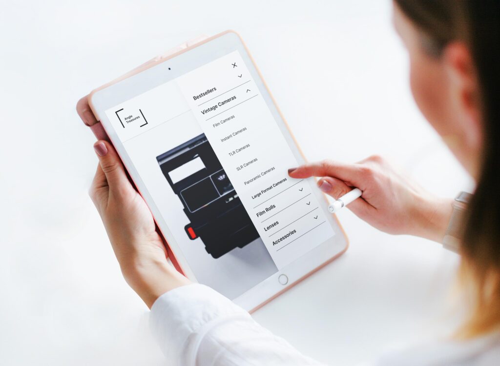
#6 Provide A Logical Navigation Structure
With a non-logical navigation structure, visitors struggle to find the content they are looking for and are likely to leave the website before they have reached their goal. Whether it’s informing visitors through blogs and news articles or selling products: you want as many visitors as possible to complete a goal. The navigation structure, together with your search bar, is the most important part of your website to achieve this. A logical and clear menu ensures that your target group quickly finds the content they are looking for and that they get a good idea of what can be found on your website.
#7 Do Not Use Drop-Down Menus
Drop-down menus, also known as drop-down menus, are experienced by many visitors as annoying because they often do not work well on devices without a mouse. You sometimes have to hover over just the right piece to make the submenu slide out. If you are wrong at all, everything collapses again, and you can start again. Very frustrating! In addition, with a drop-down menu, it is also very easy to add many menu items. This can be confusing for the visitors, because they then have too much choice. It is better to replace drop-down menus with category pages.
#8 Use A Single-Image Header Instead Of A Multi-Image Slide
A slider gives you the opportunity to promote more content without taking up more space on your page. Still, the numbers show that sliders are not effective. No visitor takes the time to view all the images from the slider banner. It is very distracting and hinders the visitor in his task of finding what they are looking for. That causes frustration.
#9 Use Good And Sharp Photos
Visual images leave a big impression, so make use of images to attract the attention of visitors. Insight into the target group plays a role here. Among other things, the gender, age, and interests of your target group determine the emotion of the image you choose. The image quality also plays an important role in forming an impression on the minds of the visitors. Lower-quality images are equivalent to a company that is not professional. You can fail in the very first step of gaining the trust of visitors.

#10 Make Sure Your Website Has A Professional Look And Design
You only have one chance to make a first impression, so it has to be right from the start. The appearance of a website is the reason for many people to decide within a few seconds to stay or leave again. How happy do you become when you open your website? If you are not enthusiastic yourself, chances are that visitors will also leave disappointed.
#11 Describe The Result Of The Action In The Call-To-Actions
The purpose of the call-to-action is to get visitors to do something. You want to encourage visitors and influence their behavior to take a certain action. For example, “click here” says nothing about what to expect, nor does it give a sense of security. You can activate visitors by using verbs. Think, for example, of registering, requesting, downloading, starting and doing. The words invite you to take a certain action. Writing in the first person also has a positive influence on the click-through rate, for example, “sign me up” works better than “sign up.”
#12 Organize 404 Pages Smartly
First, of course, you should try to prevent visitors from seeing a 404 page. If a visitor does somehow end up on a 404 page, be prepared for that by organizing the page smartly. For example, add a link to another page so that the visitor does not drop out and can come back as easily as possible within the conversion process.

Final Words
An ecommerce business cannot survive without having consistent improvement in sales. To grow sales might appear tough. But the improvement in certain areas of a website, such as “performance,” can effectively boost ecommerce sales.
In today’s blog, we shared the top 12 techniques that, if followed, will improve your website performance extensively. With better website performance, your overall ecommerce sales will also grow. So without any delay, go try these techniques now!